You have no items in your enquiry basket.

Branded gifts that match your brand Pantone reference
This entry was posted on January 9, 2019
 Durham Inner and Outer ColourCoat Custom Mug. PC1800797
Pantone products to match your brand and style..
It’s a well known fact that colours have meaning. It's why many businesses go to great lengths when working with creative professionals to choose their corporate branding. They spend a lot of time considering colour to ensure their company colours match the values and goals they wish to portray.
At Pellacraft we are passionate about ensuring we are up to date with changing trends and the emergence of new products and print methods. We want to ensure our customers always have a wide range of business gifts and promotional merchandise that provide a wide choice of colour options as possible.
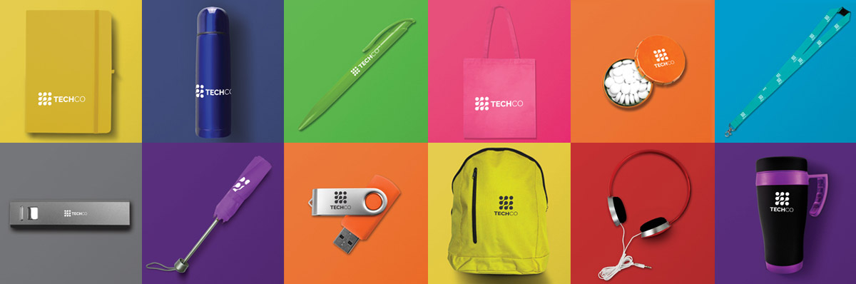
In fact, we have recently started to source and add many more items that can be coloured matched to your required Pantone reference, helping you to secure brand consistency and recognition. So, if you need a promotional gift in an exact colour, it's worth asking if we can supply it Pantone matched.
Pantone Colour of 2019
As you would expect, designers are very passionate about colour and keen to be at the forefront of emerging trends and a driving force behind colour innovation. So much so, that each year, experts from the Pantone Colour Institute comb the world looking for new colour influences and carry out a process of thoughtful consideration and trend analysis to arrive at the Pantone colour that will be selected as the Pantone colour of the year.
For 20 years, Pantone’s Colour of the Year has influenced product development and purchasing decisions in multiple industries, including fashion, home furnishings, and industrial design, as well as product, packaging and graphic design.
The chosen colour for 2019 is PANTONE 16-1546 Living Coral, chosen because the colour emits the desired, familiar and energising aspects of colour found in nature. PANTONE Living Coral is evocative of how coral reefs provide shelter to a diverse kaleidoscope of colour.
Other Colour Meanings...
The symbolism of colours is one of the most exciting aspects of visual communication. Each has its own unique interpretation.
Red
Red is the colour of fire and blood. Used in flags it represents a sense of pride. It's often associated with love – representing excitement, energy, passion and sexuality, symbolising desire, power, speed and strength. Yet, it can also stand for aggression, danger, violence and war. Red is intense and can steal attention from other colours. It provokes emotions and calls to action or becomes a warning.
Yellow
Yellow is a colour associated with sun. It symbolises optimism, energy, joy, happiness and friendship. It might also stand for intellect. On the contrary, yellow can indicate jealousy, betrayal, illness and danger. It is strongly associated with food, often evoking cheerful feelings.
Orange
Orange is a secondary colour that combines two primary colors: red and yellow. It stands for energy, happiness and the joy of live. Furthermore, it is associated with great enthusiasm, encouragement, determination and stimulation. It is a colour of creativity! Orange gives a strong sensation of heat, but it does not have the aggressiveness of red.
Blue
Blue is cool and calming primary colour that stands for intelligence, openness, spirituality and creativity. It's popular among large concerns, hospitals and airlines, since it symbolises wisdom, trust, loyalty and strength. It is relaxing and prevents from chaos.
Green
In general, green is the colour of nature and environment that combines the power of blue and yellow. Green is associated with growth, health, renewal, youth, harmony, freshness and fertility. On the other hand, it can symbolise safety in a metaphorical and physical way. For some people, it is strongly associated with money.
Purple
Purple has the stability of blue and the energy of red, two primary colours. It is associated with royalty, nobility, ceremony, mystery, transgression and spirituality. It also symbolises both wisdom and enlightenment, it is a strong indicator of imagination.
White
White symbolises light, power, elegance, death and mystery. It is strongly associated with cleanliness, purity, and safety. White can be used to promote simplicity and it is often used in modern design.
Black
Black stands for power, elegance, death, evil and mystery. It often symbolises the fear of unknown. Black gives a feeling of depth, but often diminishes readability.
Can we Pantone match your next branded gift order?
If we can help by colour matching your next promotional merchandise order, please get in touch with one of our friendly customer service advisers today on 01623 636 602 or via LiveChat on our website.